Updated: February 22, 2013
Just a few days ago, LibreOffice 4 was released. As you know, this is an important milestone, both technically and historically. Since the split from OpenOffice, managed by Oracle, LibreOffice has quickly grown to become the dominant open-source office suite, and has completely pushed away OpenOffice from the spotlight. Moreover, this latest version brings a whole bunch of good things.
In my last review, I did opine some skepticism about what LibreOffice is all about, although it did what was expected from it. Let us see how things have changed in the last two years. Finally, we will give some extra focus to the Microsoft Office compatibility, because it is one of the most cardinal issues around. Follow me.

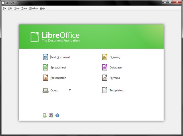
Next, I visited the official page documenting some of the changes and tried a few of them, including various templates, PDF import and such. On paper, this functionality, or rather, this plethora of features is all nice and dandy, but there's something more important that we want to check.


When I opened the file in LibreOffice 4, the conversion worked fairly well, including all the formatted stuff. The comments were there too, as well as of the tracked changes. The only thing that was out of place was the image shadow, which was imported somewhat ugly.

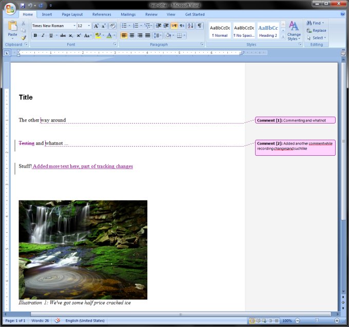
Then I opened the file in Microsoft Office 2007. Most importantly, Word did NOT complain the file was corrupt, like it would in the past. It opened the file smoothly and without any warnings or errors. As to the fidelity of the conversion? Well, you judge for yourself. Most of it worked fine, but not all. Line spacing was all wrong, although changes, comments and styles were preserved. However, line breaks in comments were not done well, probably due to the difference in UNIX and Windows carriage returns. It's so much better than in the past, but there's always a little detail that mars the process.

Later on, I also ran tests with Office 2010, and saved files as both DOC and DOCX in LibreOffice 4, then tried to opened them in the Microsoft suite. Worked like a charm, and again, without any warnings. This is critical, BUT the quality of documents is equally important, and still, we end up with some discrepancies.


And working, sweating, earning and burning - quite all right:


LibreOffice 4 is not perfect, but its most serious problem is the fact the interface is cluttered and not very productive. I have not lingered too much on this aspect of the office suite usage, but it's obvious, isn't it. Take a look at the programs and think carefully, how comfortable you feel using them. Now, I am not saying use the ribbon nonsense like Office, but a redesign is sorely needed. There is just too much of everything, not enough focus on styles, image management is clunky, and you can work faster elsewhere.
To wit, LibreOffice 4 deserves around 8/10. It's a sure keeper, and I am glad to have it added to my arsenal, both on Windows and Linux. I just wish it could become a killer app, but the path thither is still long and perilous. Well, let's hope version 5 will make that a reality.
Cheers.
Source: http://www.dedoimedo.com/computers/libreoffice-4-review.html
Just a few days ago, LibreOffice 4 was released. As you know, this is an important milestone, both technically and historically. Since the split from OpenOffice, managed by Oracle, LibreOffice has quickly grown to become the dominant open-source office suite, and has completely pushed away OpenOffice from the spotlight. Moreover, this latest version brings a whole bunch of good things.
In my last review, I did opine some skepticism about what LibreOffice is all about, although it did what was expected from it. Let us see how things have changed in the last two years. Finally, we will give some extra focus to the Microsoft Office compatibility, because it is one of the most cardinal issues around. Follow me.

LibreOffice tour
At a first glance, LibreOffice does not look much different from its earlier versions. However, there's an obvious fresh air of improvement present. For me, the most visible change is the distinct improvement in responsiveness and loading times, even without the use of the Quickstarter. If previously, LibreOffice would take 3-4 seconds to launch, this time has been shortened to about half that. Cosmic.
Next, I visited the official page documenting some of the changes and tried a few of them, including various templates, PDF import and such. On paper, this functionality, or rather, this plethora of features is all nice and dandy, but there's something more important that we want to check.


Microsoft Office compatibility
This is the devil. So let's see what gives here. If you've read my comparison article, then you know there's a whole bunch of issues trying to work with LibreOffice and importing and exporting files to the rival, proprietary software. As an advanced user, you can get around these, but your weakest links are your clueless friends and colleagues with zero tolerance to any possible styling glitches that might arise from cross conversions.Microsoft Office to LibreOffice
This was the first test I did. I created a DOCX file in Microsoft Office 2007, inserted a picture with a shadow, added comments and tracked changes. Indeed, tracking is one of the most important features for collaboration.
When I opened the file in LibreOffice 4, the conversion worked fairly well, including all the formatted stuff. The comments were there too, as well as of the tracked changes. The only thing that was out of place was the image shadow, which was imported somewhat ugly.

LibreOffice to Microsoft Office
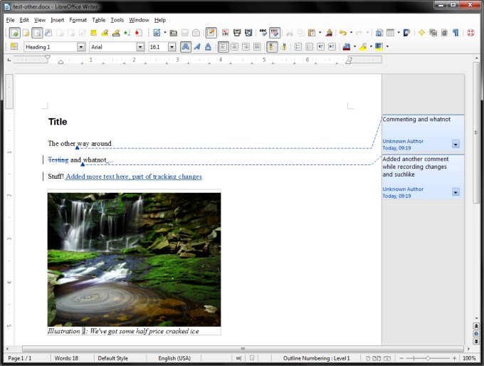
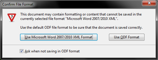
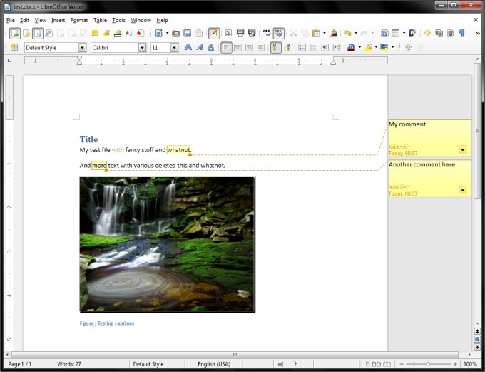
Then, I did the reverse trick. I created a file in LibreOffice, used styles for titles, wrote some comments and changes, plus added an image with a caption. Then I saved the file as a DOCX. As always, you do get a warning when you're saving files in non-ODF format, but this is fine.

Then I opened the file in Microsoft Office 2007. Most importantly, Word did NOT complain the file was corrupt, like it would in the past. It opened the file smoothly and without any warnings or errors. As to the fidelity of the conversion? Well, you judge for yourself. Most of it worked fine, but not all. Line spacing was all wrong, although changes, comments and styles were preserved. However, line breaks in comments were not done well, probably due to the difference in UNIX and Windows carriage returns. It's so much better than in the past, but there's always a little detail that mars the process.


Later on, I also ran tests with Office 2010, and saved files as both DOC and DOCX in LibreOffice 4, then tried to opened them in the Microsoft suite. Worked like a charm, and again, without any warnings. This is critical, BUT the quality of documents is equally important, and still, we end up with some discrepancies.

Tracking changes
Worked really well - so much better than previous versions, and this used to be one of my major complaints. However, the Review Toolbar is missing, but you can install it through the Extension manager. Much like OpenOffice in this regard.

And working, sweating, earning and burning - quite all right:


A few words about Impress and Calc
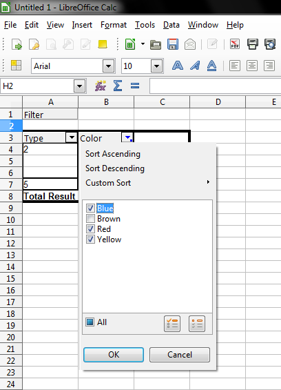
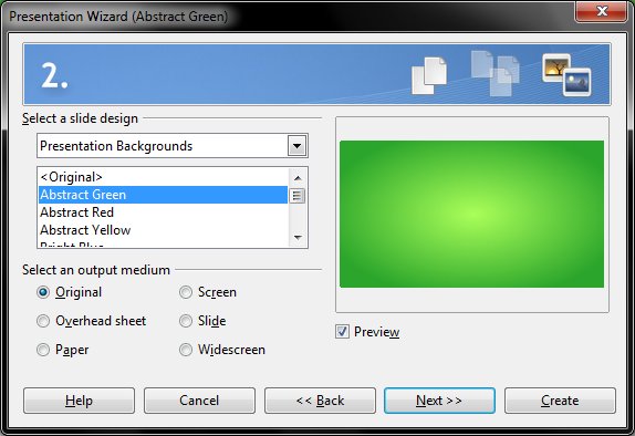
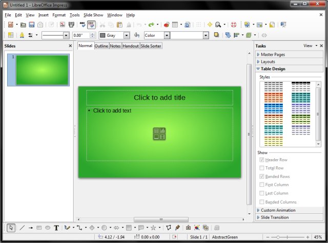
Normally, most other components are neglected. Well, I gave both some scrutiny. For example, Calc handles pivot tables with more grace in the past, although it still does not have automatic graphs. Impress offers a nice template wizard on first launch, but in my experience, it was slow and sluggish. Not nice. Well, at least the names are in order, and not like the Crunchbang exercise of using themes with color names that do not match the actual colors.


Conclusion
As a pure office suite, LibreOffice 4 is quite decent. It brings a lot of improvements, including much better responsiveness, better but still inadequate support for Microsoft Office, better document tracking, and some other nifty tricks and details. There's also a version for Android, which I might check in the future. All in all, fairly decent, and it does merit the full version change. On the negative side, the interface demands a refresh, and there's a lot more than can be done to allow LibreOffice users a seamless experience with their Word-fixated audience. Lastly, some bugs and glitches need to be ironed out, like the slow Impress transitions, missing functionality in programs other than the Writer, and suchlike.LibreOffice 4 is not perfect, but its most serious problem is the fact the interface is cluttered and not very productive. I have not lingered too much on this aspect of the office suite usage, but it's obvious, isn't it. Take a look at the programs and think carefully, how comfortable you feel using them. Now, I am not saying use the ribbon nonsense like Office, but a redesign is sorely needed. There is just too much of everything, not enough focus on styles, image management is clunky, and you can work faster elsewhere.
To wit, LibreOffice 4 deserves around 8/10. It's a sure keeper, and I am glad to have it added to my arsenal, both on Windows and Linux. I just wish it could become a killer app, but the path thither is still long and perilous. Well, let's hope version 5 will make that a reality.
Cheers.
Source: http://www.dedoimedo.com/computers/libreoffice-4-review.html
